Client
North Star Coffee Roasters
Services
Visual Identity
Packaging
Print Design
Digital Marketing
Photography
Collaborators
Photography by Nordfolk Studio
Website


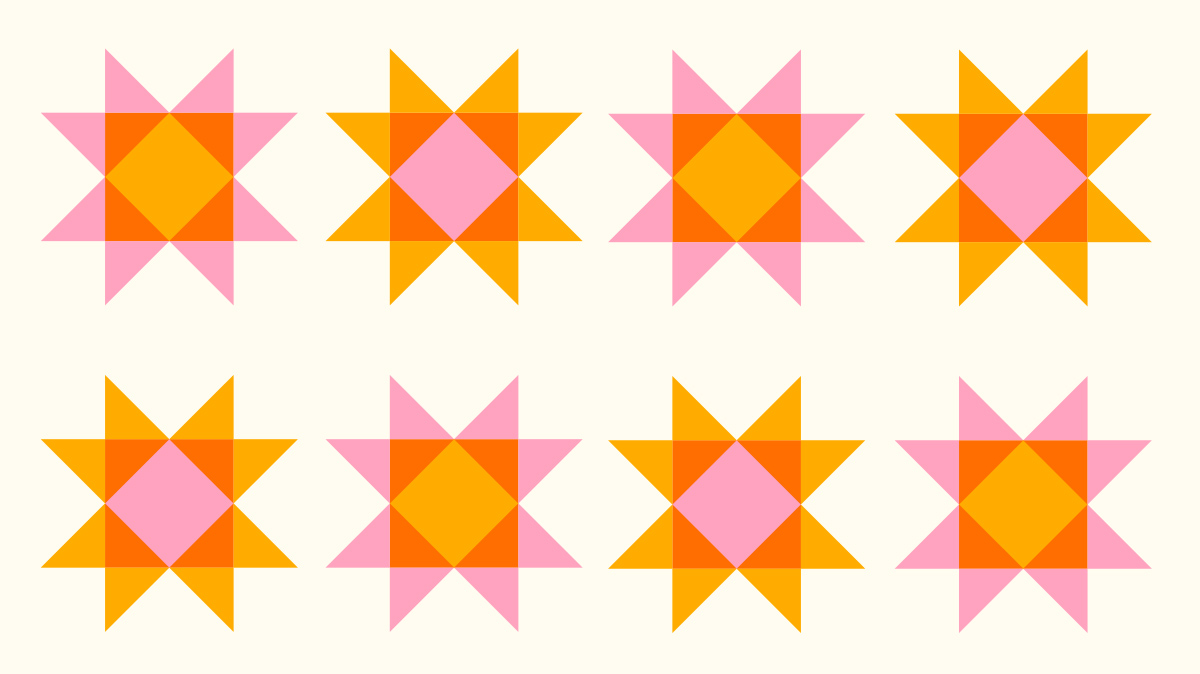
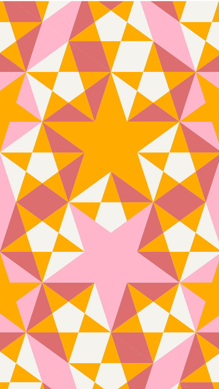
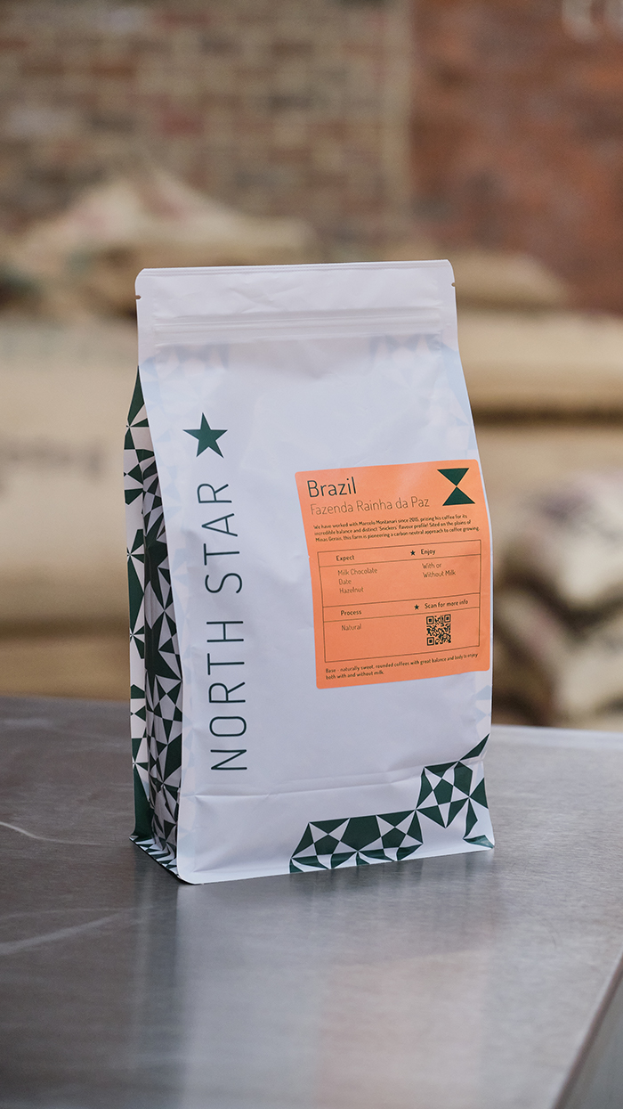
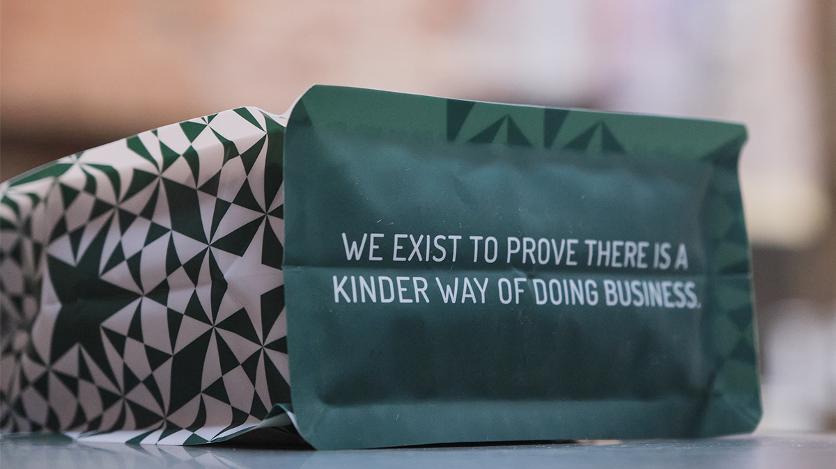
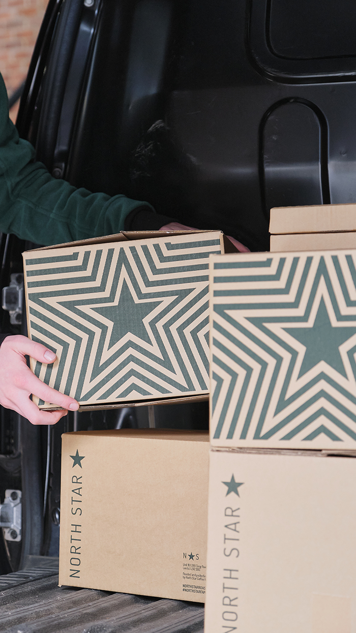
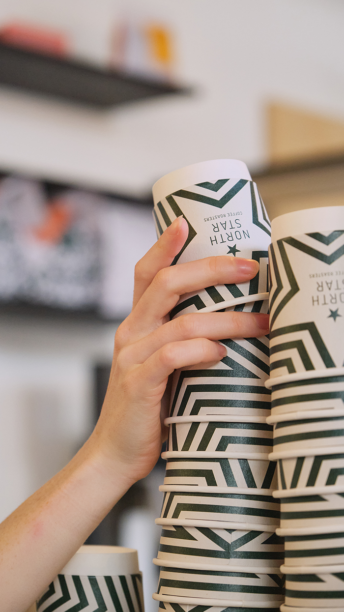
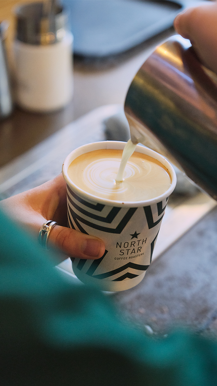
As a symbol that spans many cultures, the star shines bright at the core of North Star’s brand. Influenced by traditional quilting patterns, the design is constructed with multiple stars, which brings a tactile quality to the image.
It also reflects Latin American and African elements of design, colourful and punchy, which North Star wanted as it links to coffee origin and culture, avoiding cliche and appropriation as a matter of course.
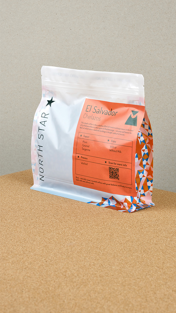
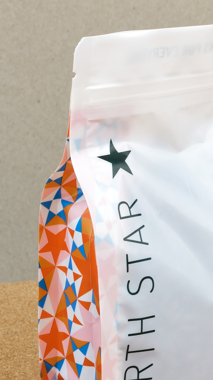
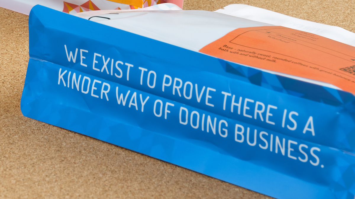

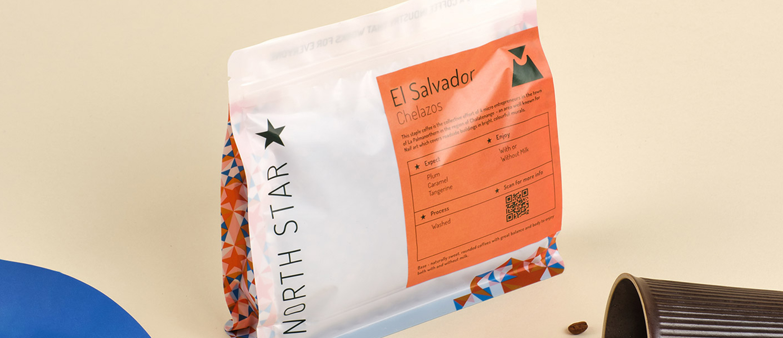
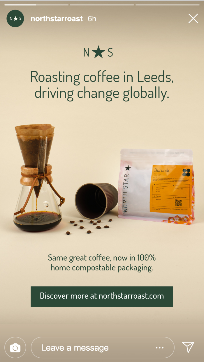
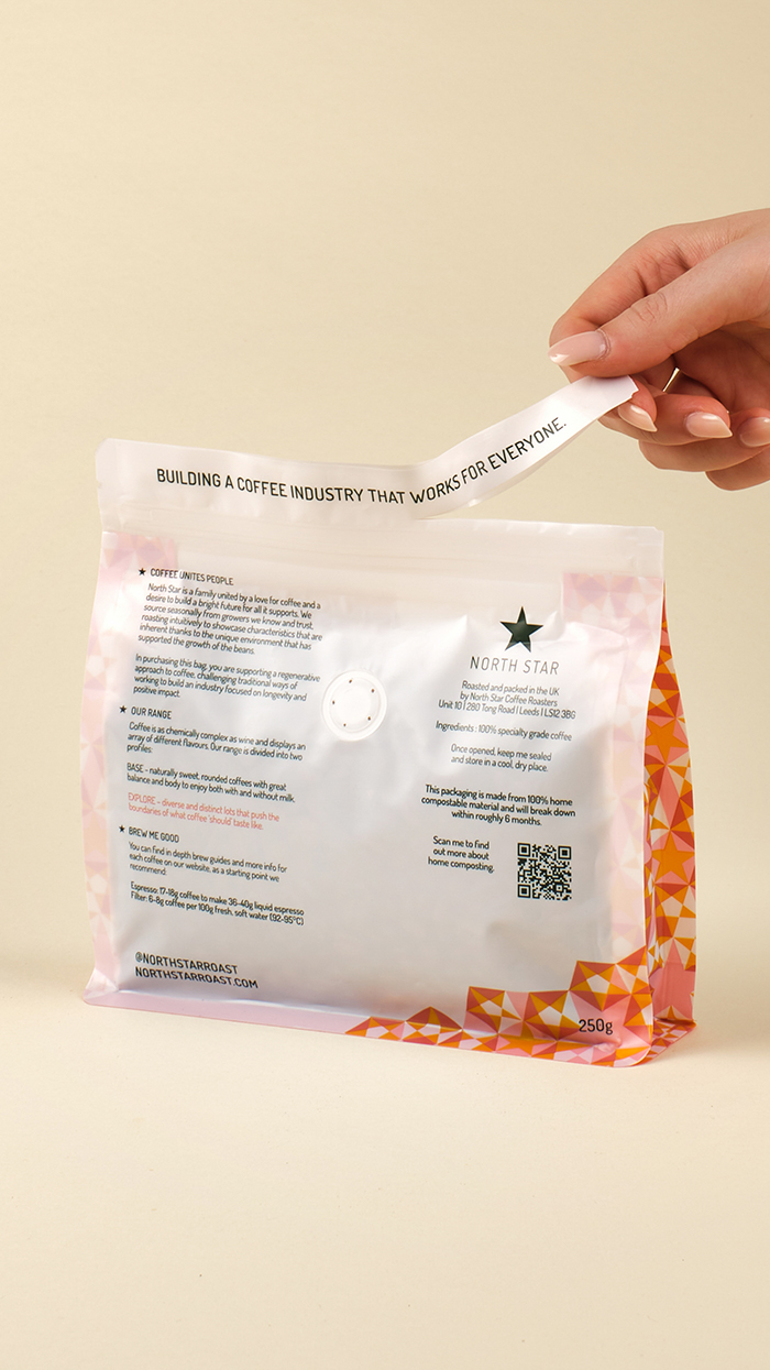
The new packaging is the first 100% home compostable coffee packaging in the U.K. meaning it will degrade in around 6 months in a well managed home compost setup. The bags have the highest percentage of biobased material (cellulose, kraft paper and sugarcane with a compostable valve) of any on the market.
The printing techniques used create less waste and utilise compostable inks – the bags are printed using a flexographic technique that uses up to 30% less ink than other methods.
The label is made from 95% sugarcane and 5% hemp and linen with a compostable adhesive being suitable for home composting too.
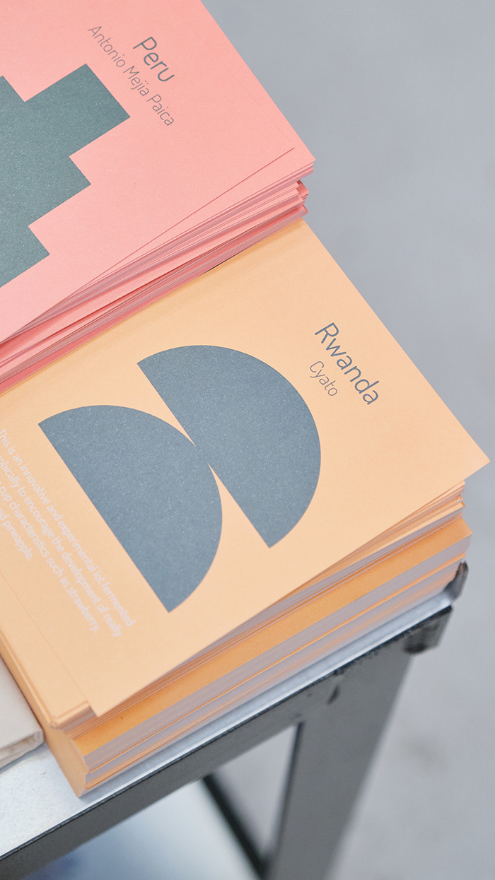
North Star’s coffees are split into two ranges, of which we utilise distinctive colours to communicate flavour. Thanks to the rebirth of QR codes, each coffee has a unique tag that links the consumer directly to videos of the coffee supplier. What a simple device that connects and informs – we’re surprised the larger roasters are ignoring this!
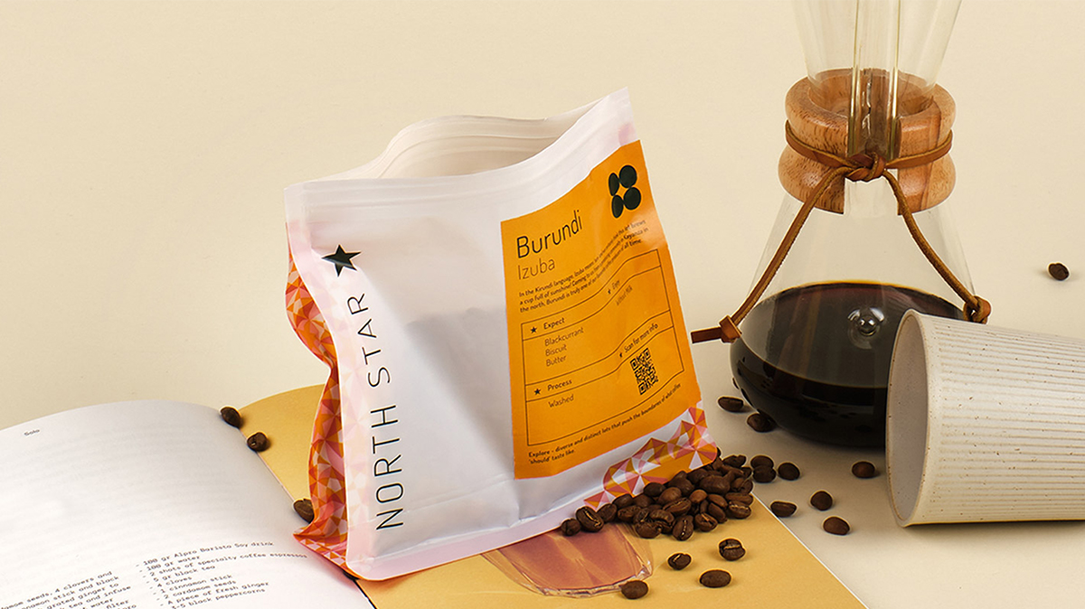
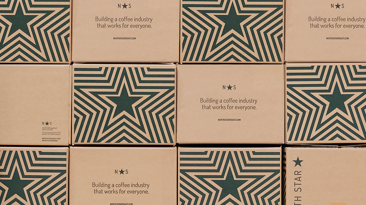
The new packaging was designed to be paired with the new letterbox-friendly box, making it easier for customers to get into their coffee fix!
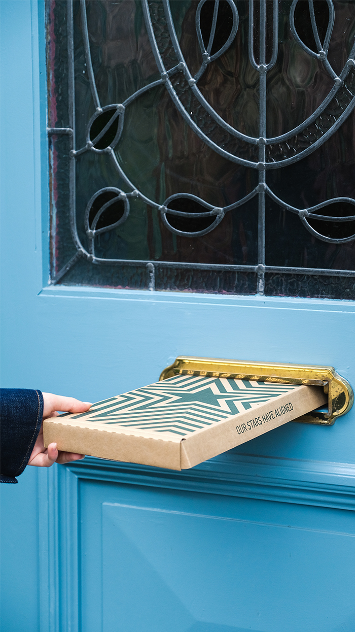
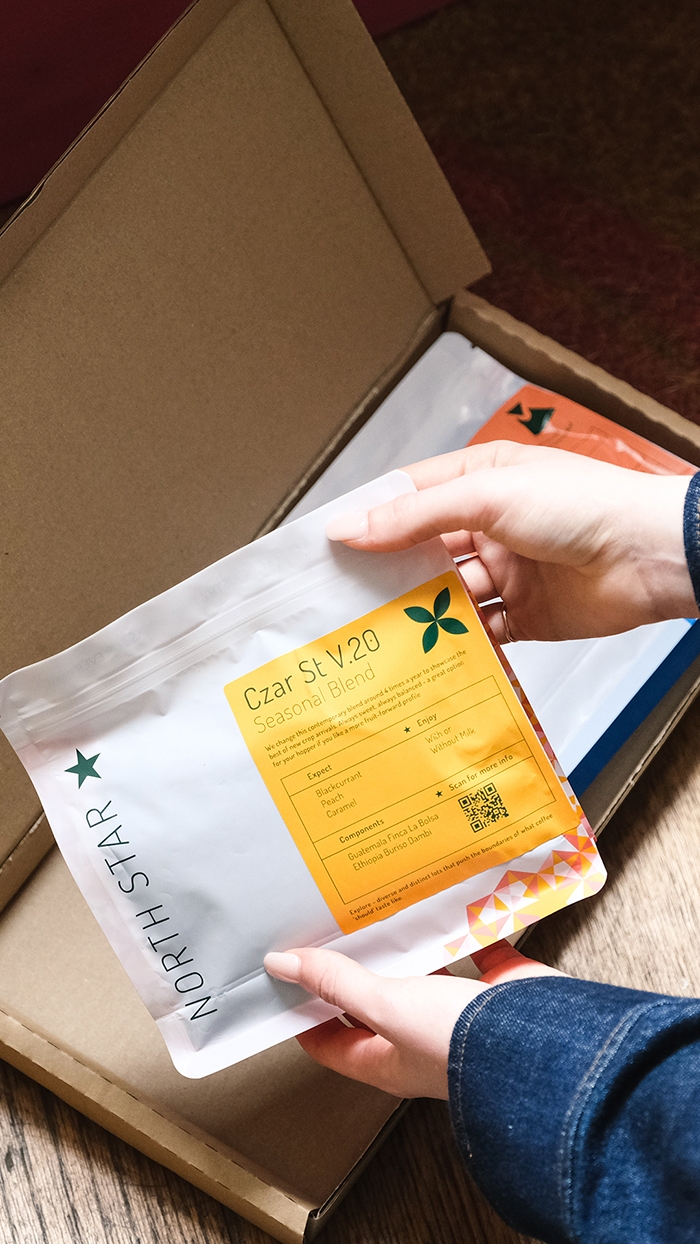
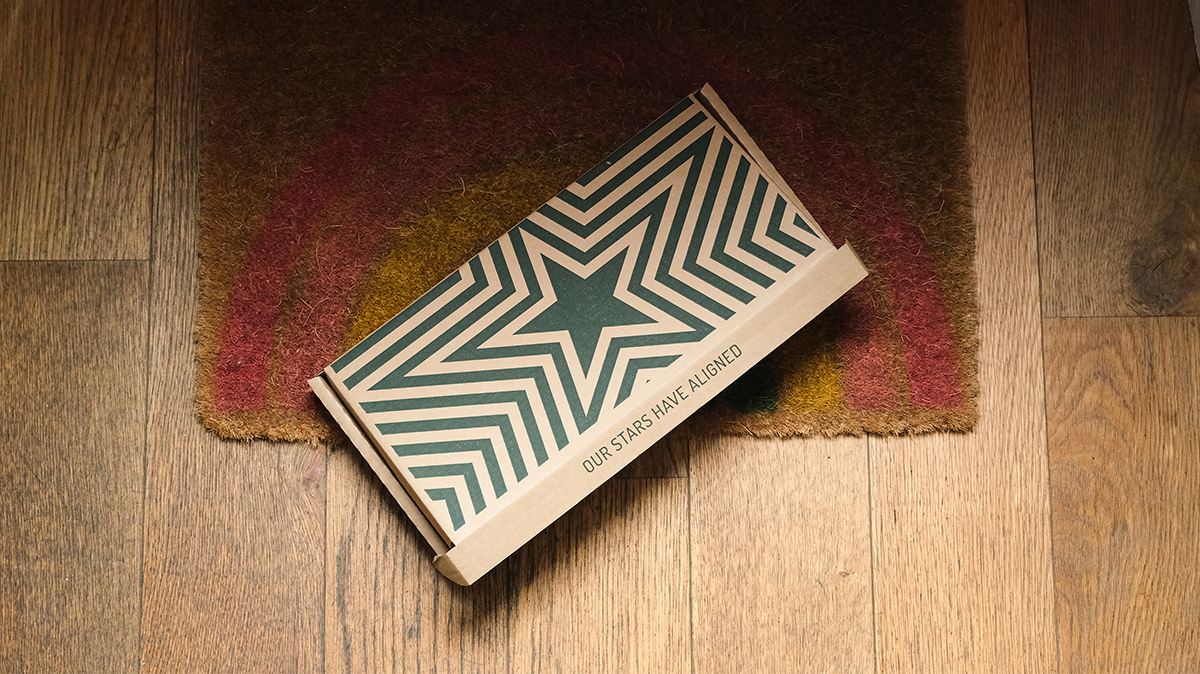
The star patterns used on wholesale packaging enhances the emotions of wonderment, beauty and product quality. We ensured the North Star brand message is visually present at all stages of their business, driving their core message: building a coffee industry that works for everyone.
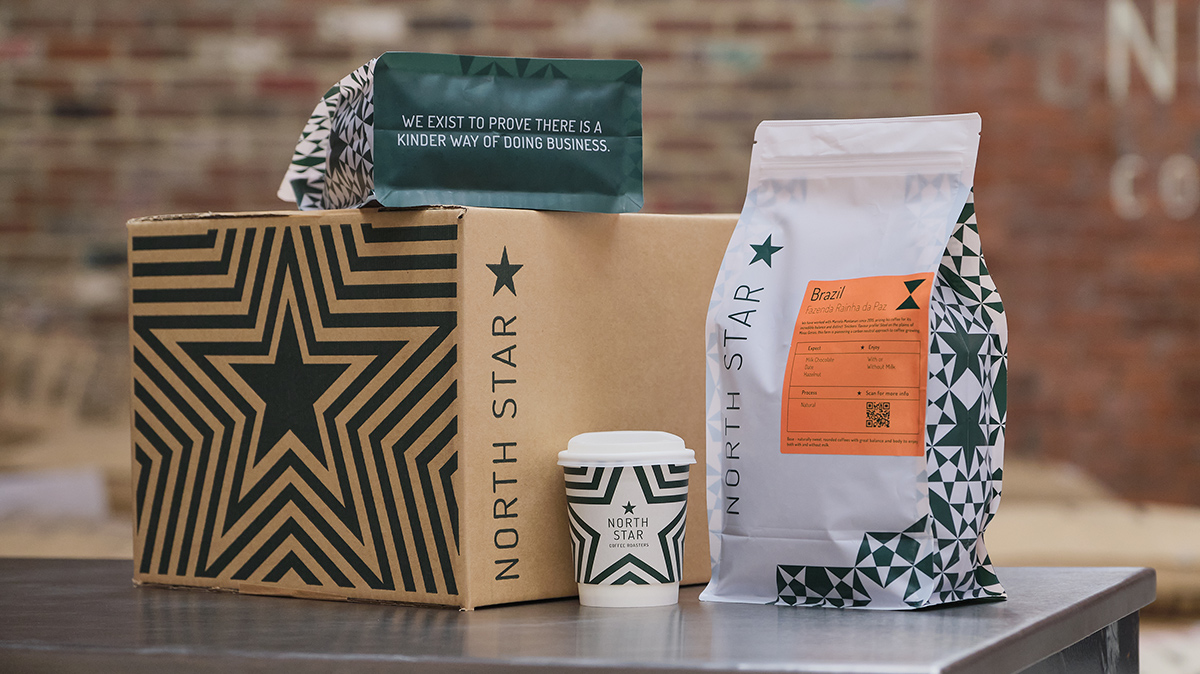
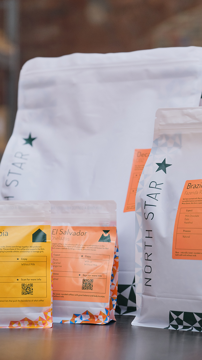
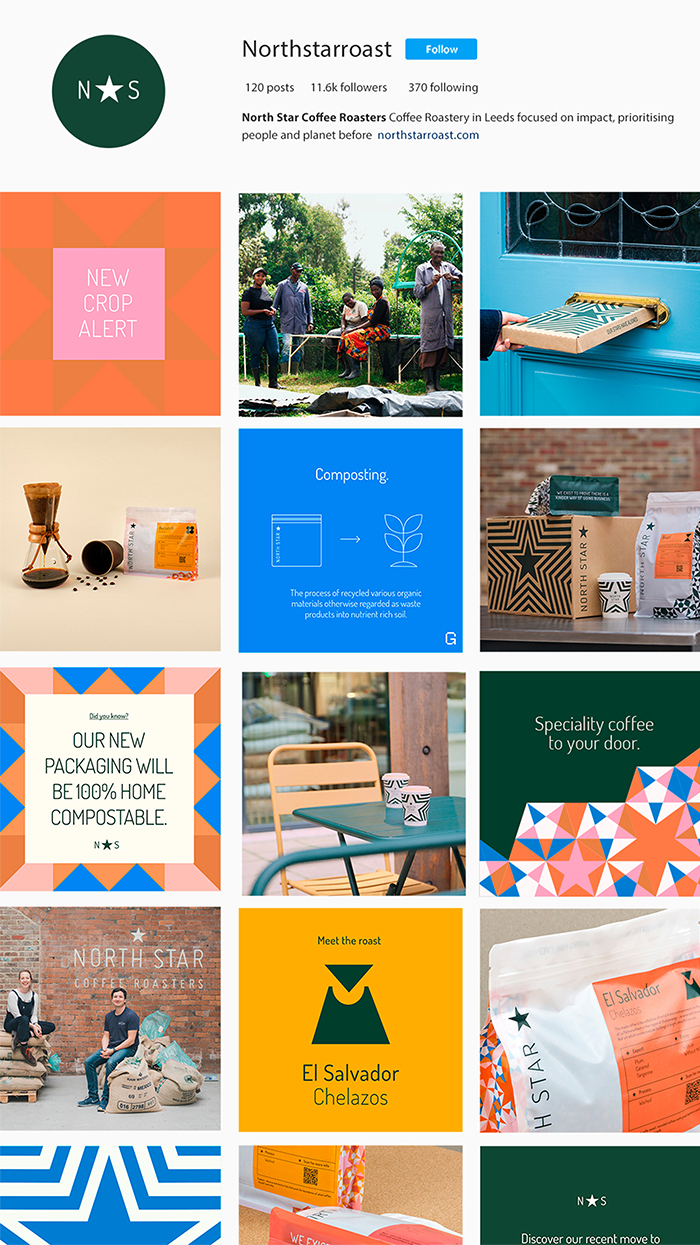
The simplified, bold geometric icons represent each coffee origin. Primarily used on the labelling and roast info cards, they do bleed into the physical branding of North Star’s signage and uniforms.
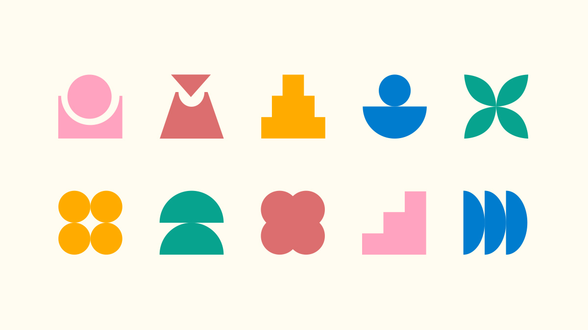
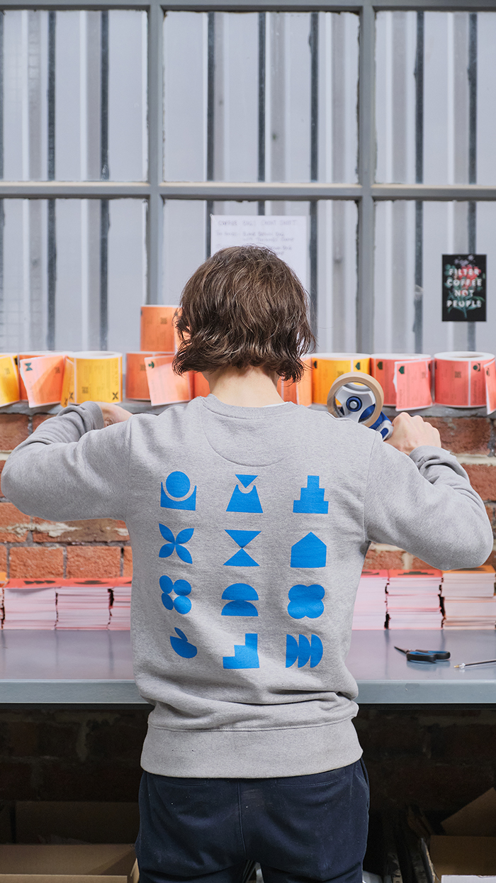
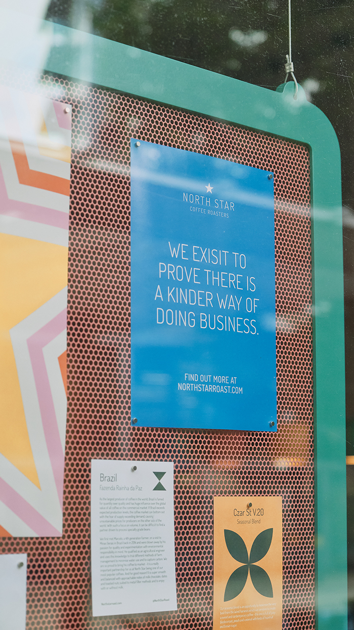
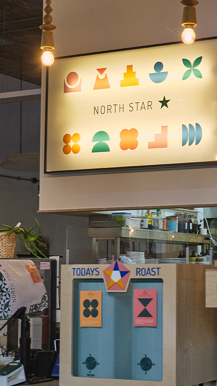
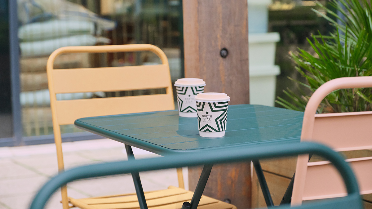
Each colour is bright and earthy, joyous and friendly. Used in this way they contrast with the natural timber tones in the cafe and enhance the sensory experience.
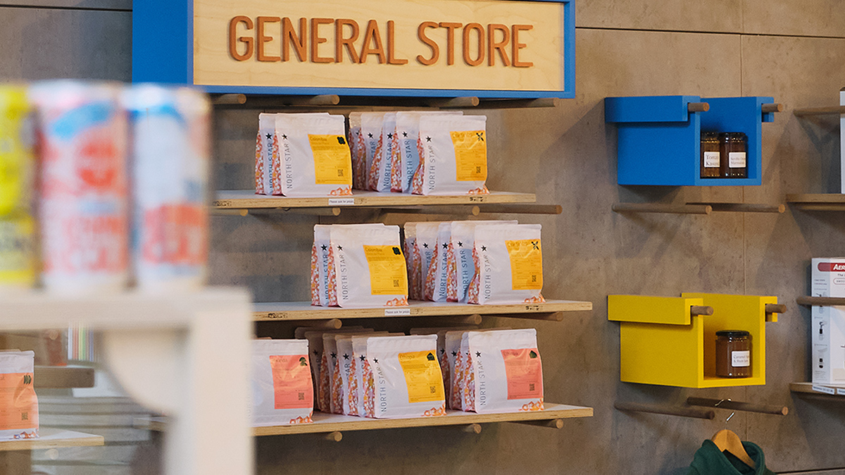
You can read more about the process of developing the UK’s first 100% home compostable packaging in a series of blogs on the North Star website, where you can also order some coffee!