
Client
House of Fu
Services
Logo Design
Branding
Visual Identity
Wayfinding & Signage
Website Design
Photography
Collaborators
Photos by Amy Heycock
Website by Glenn Taylor
Website
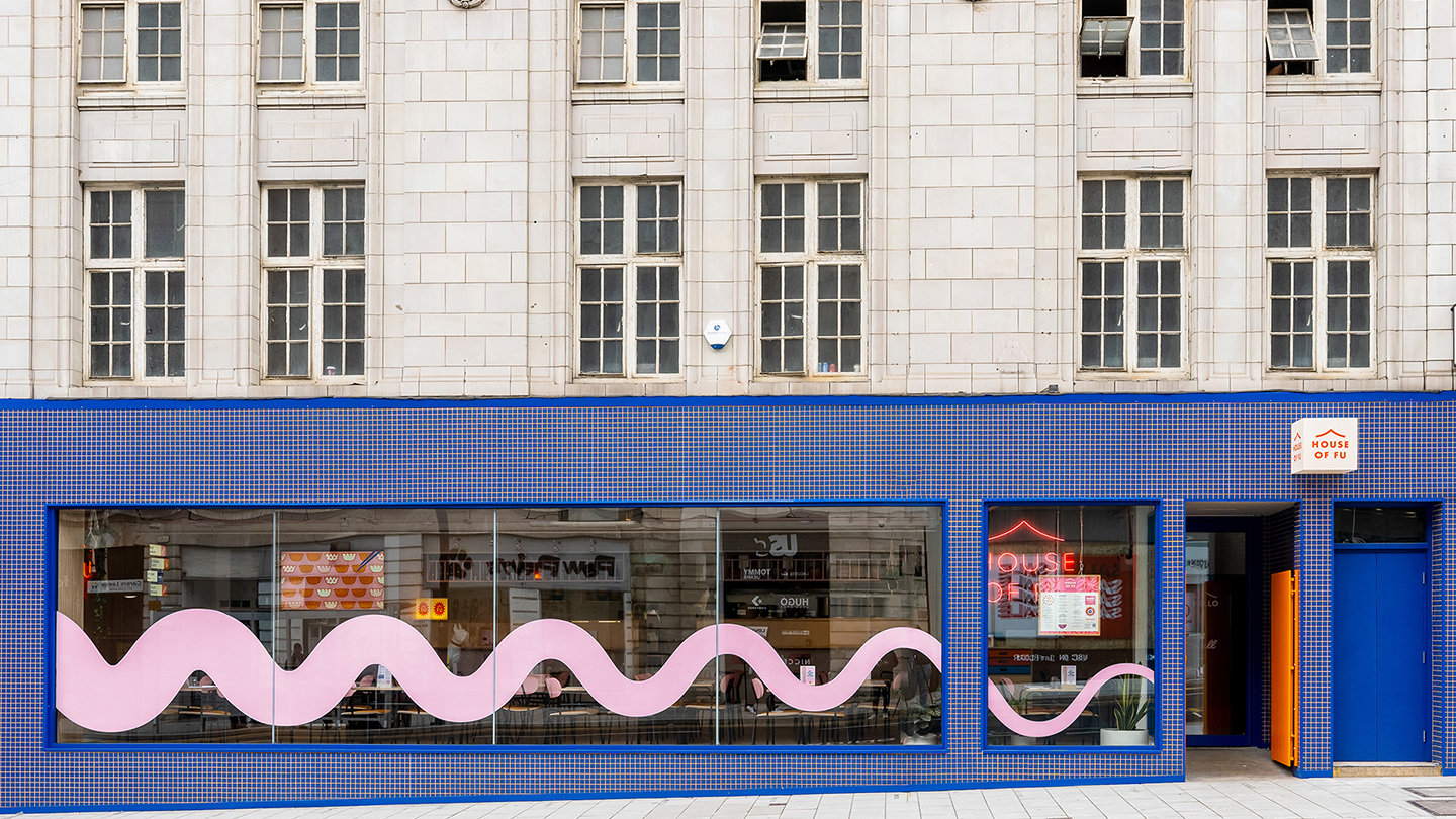
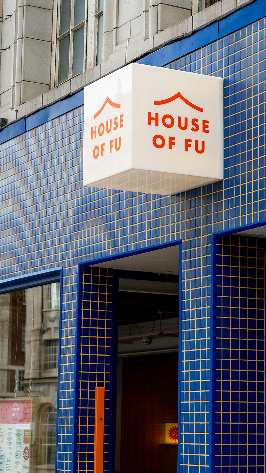
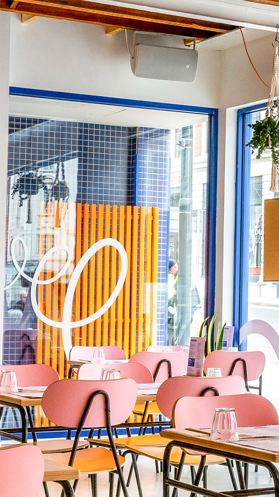
The exterior utilises unique and unexpected colour palette, demanding the attention of passers-by. A ramen noodle window graphic follows you up the street and twists until you reach the main entrance.
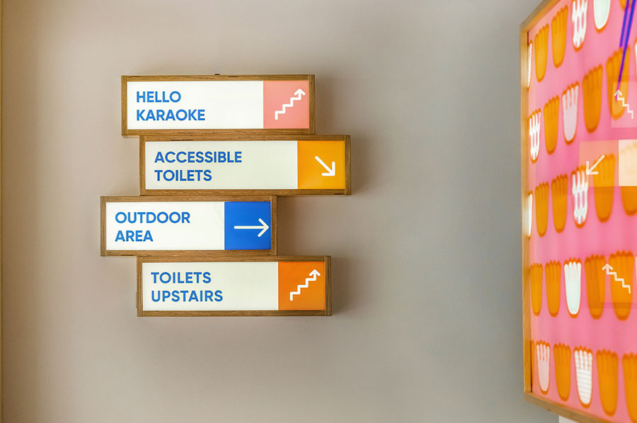
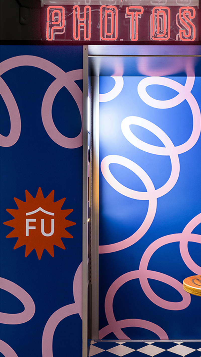
Inside is an explosion of colour mixed with natural finishes, exposed features and large glass windows. The graphic language finds its home in many places, with signage and brand touch points living harmoniously alongside the interior design.
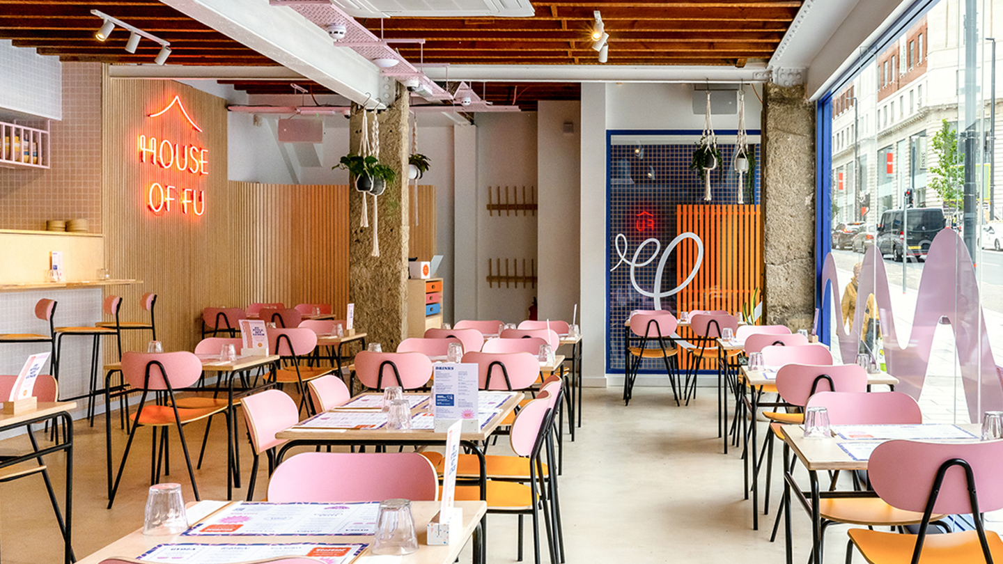
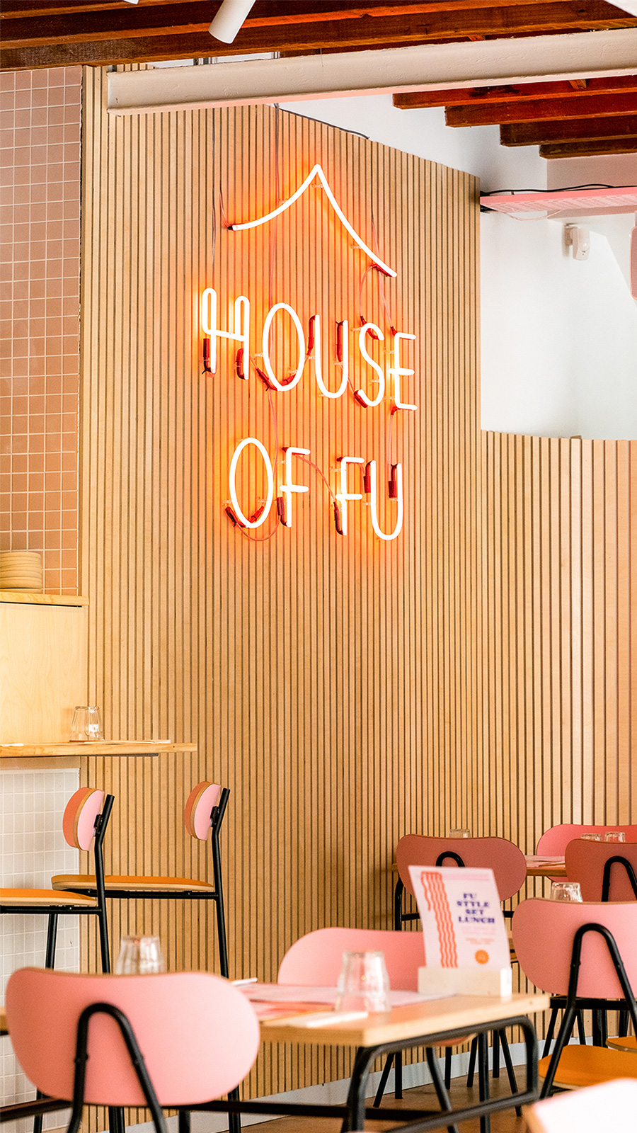
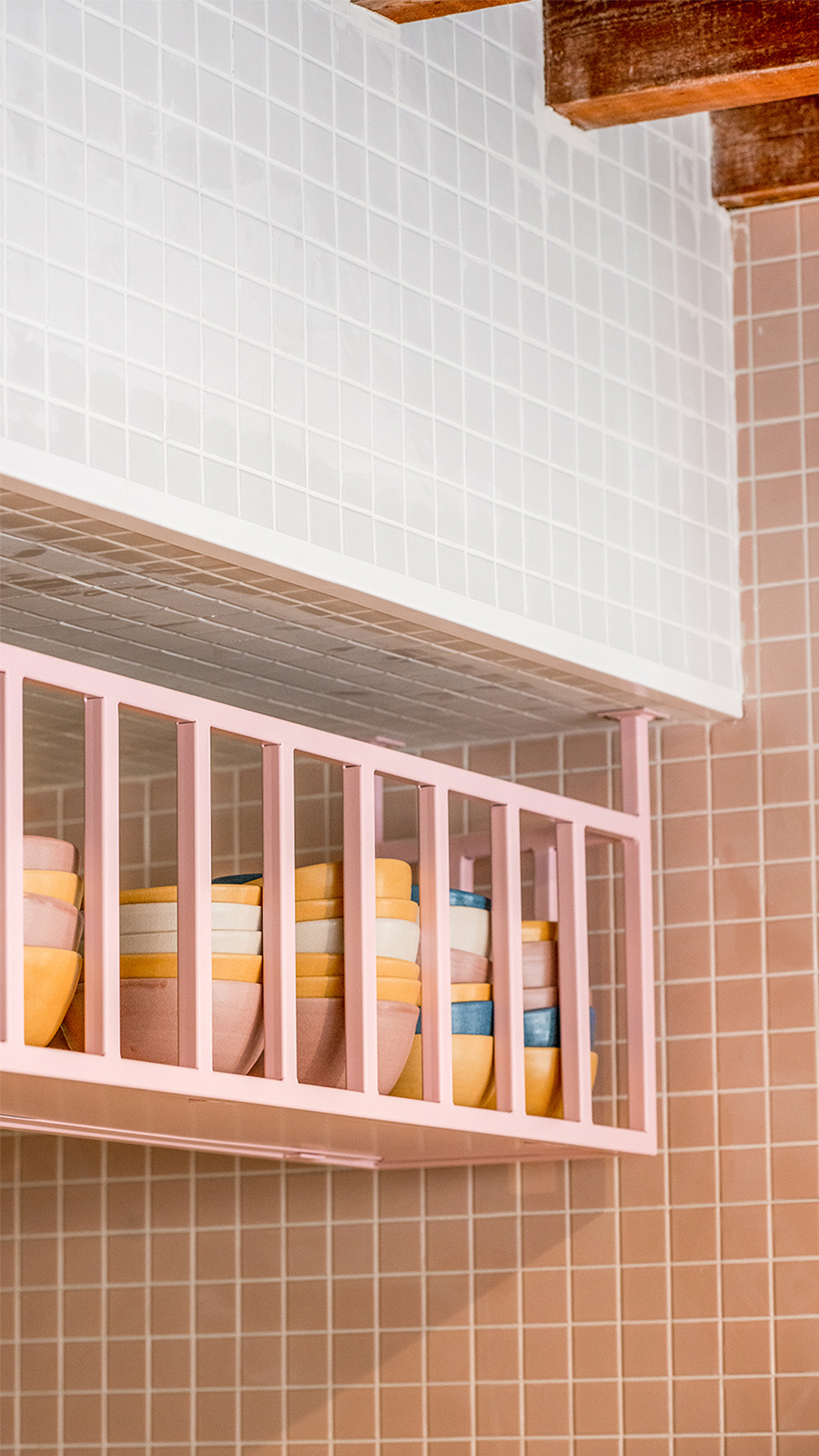
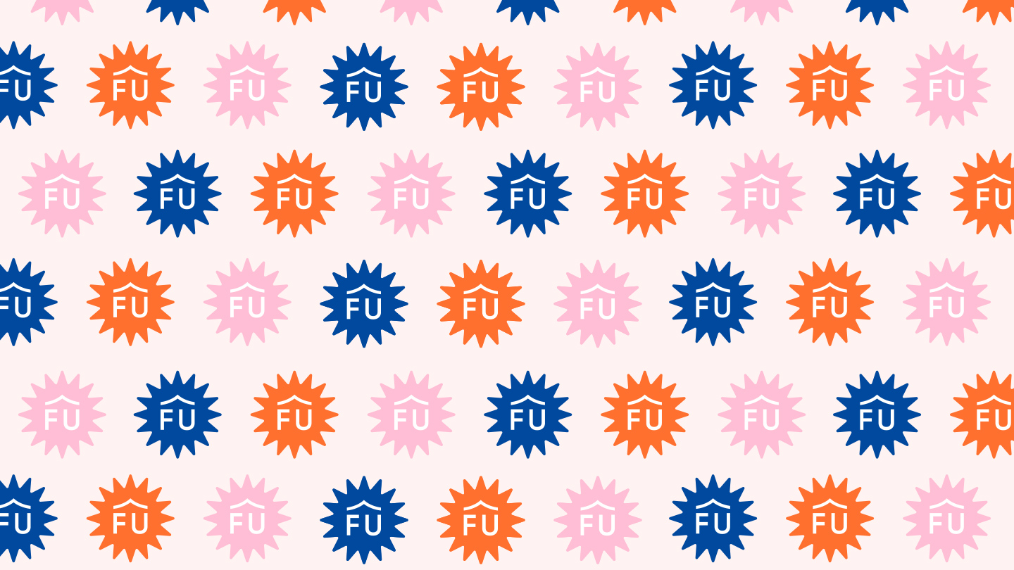
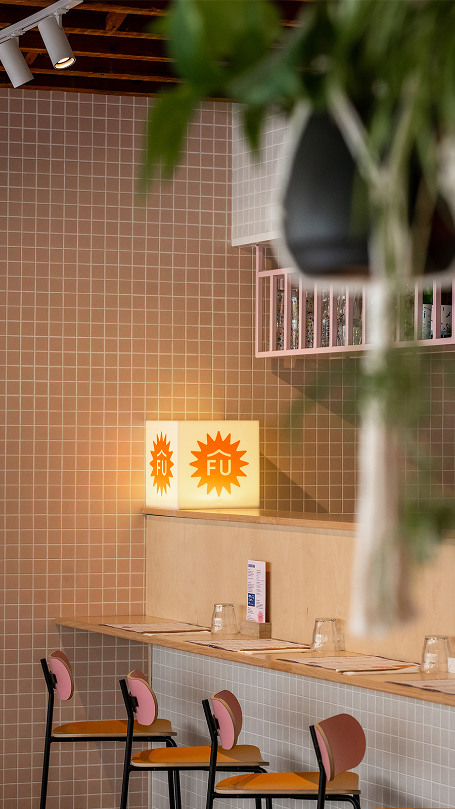
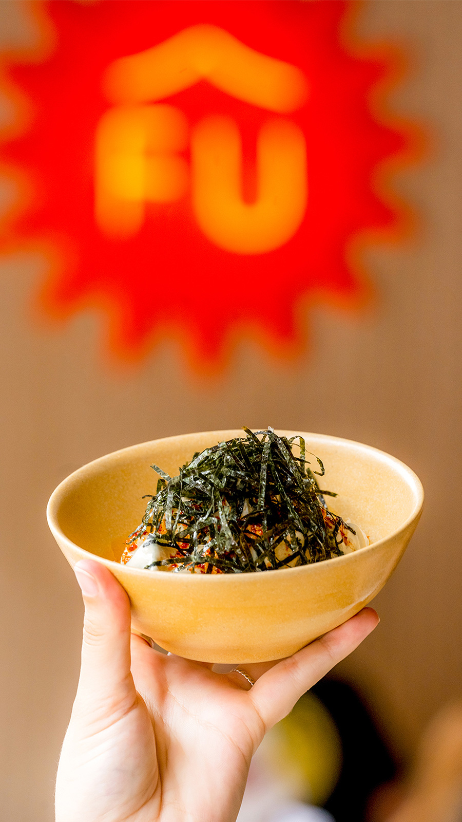
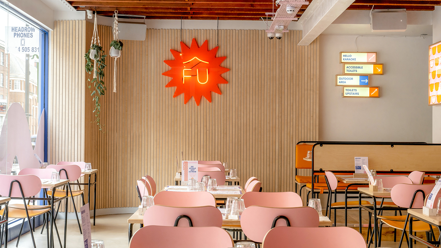
The approach was to create a style that was whimsical and classy. Vibrant blues are accented with pinks and oranges, adding flourishes of personality to the identity. Ramen culture influences the fun and dynamic elements used throughout the restaurant. Bold headline fonts with tons of character were used to contrast the minimal logotype, allowing Fu’s engaging restaurant language to coexist with their online presence and content.

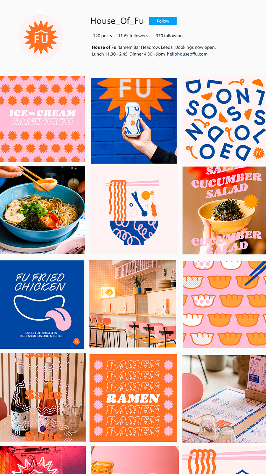
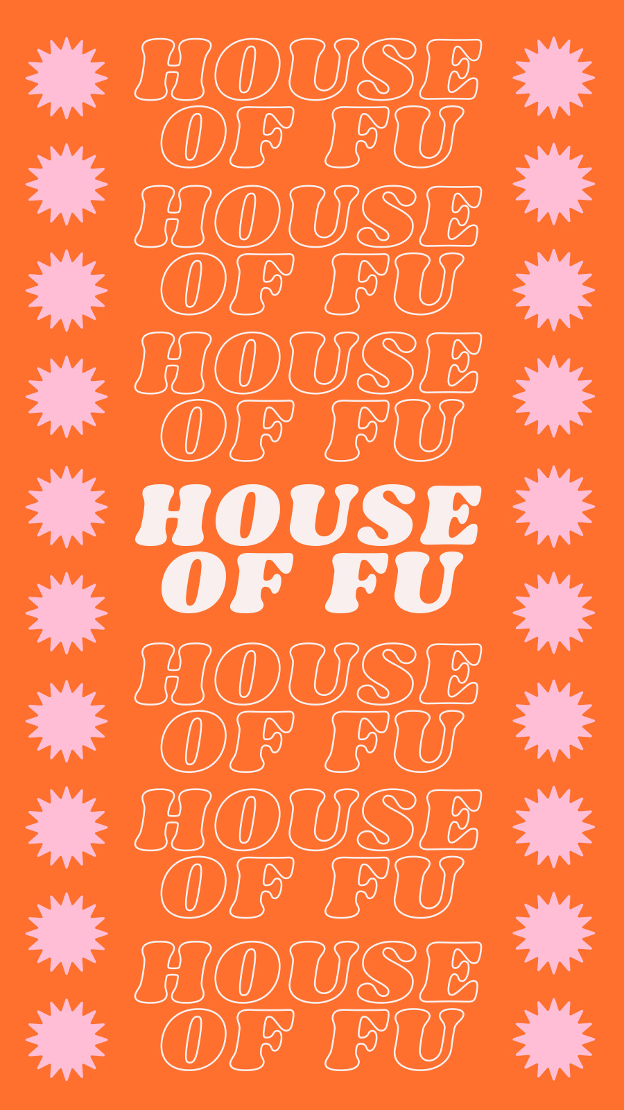
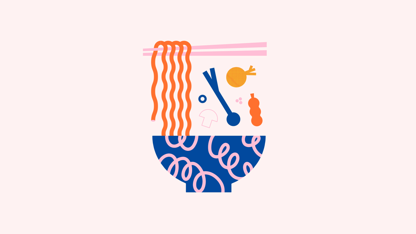
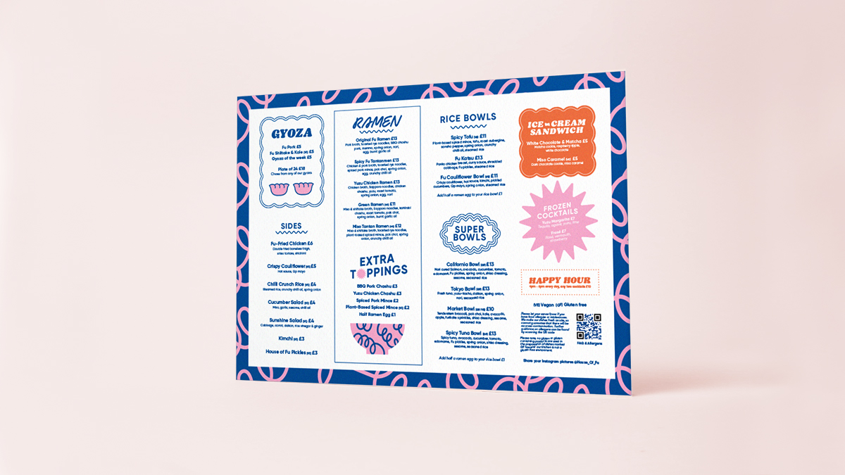
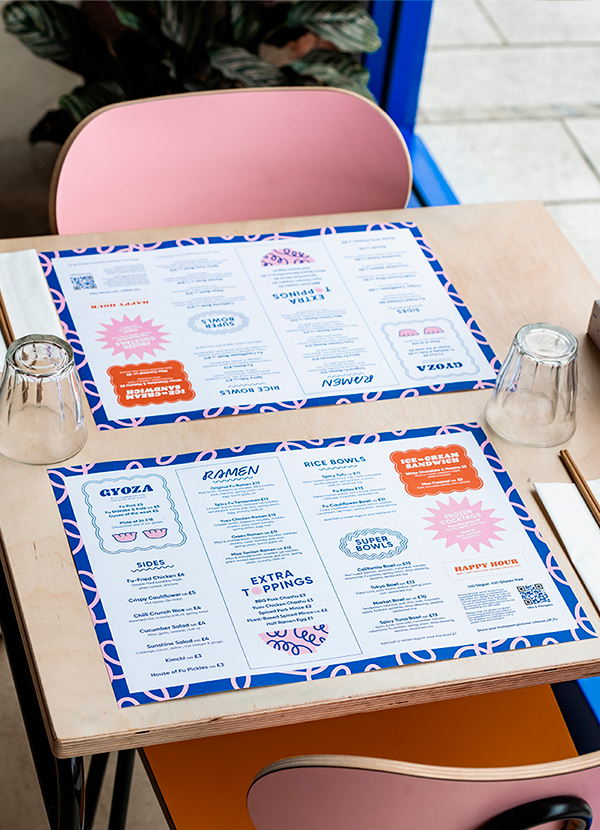
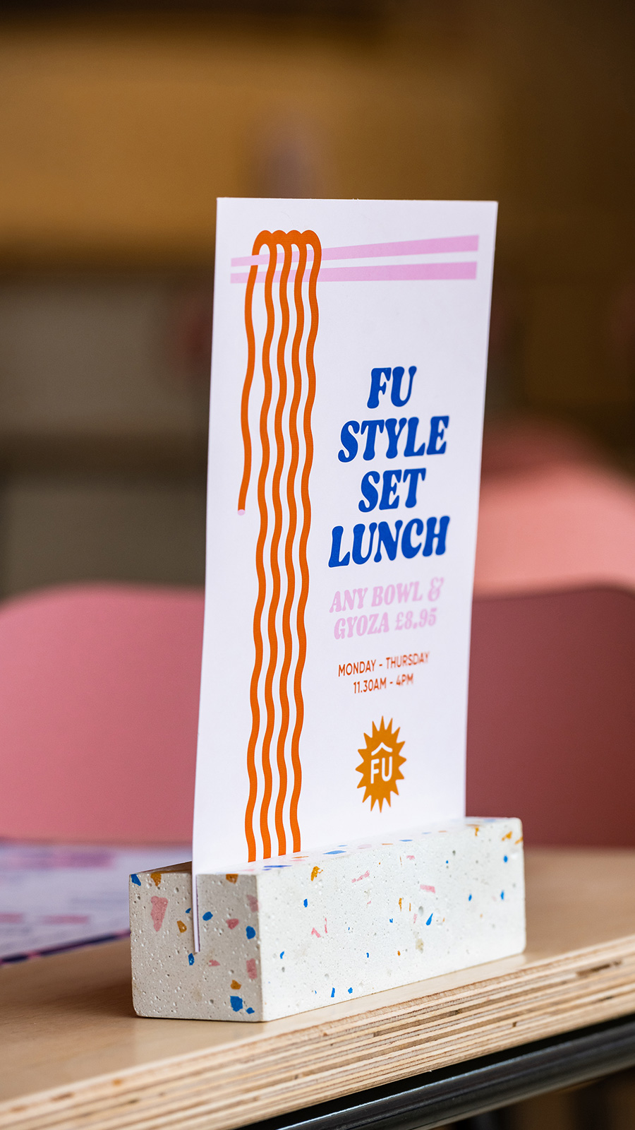
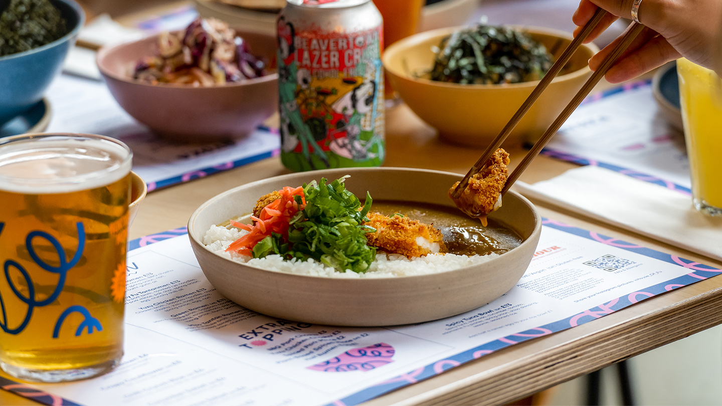
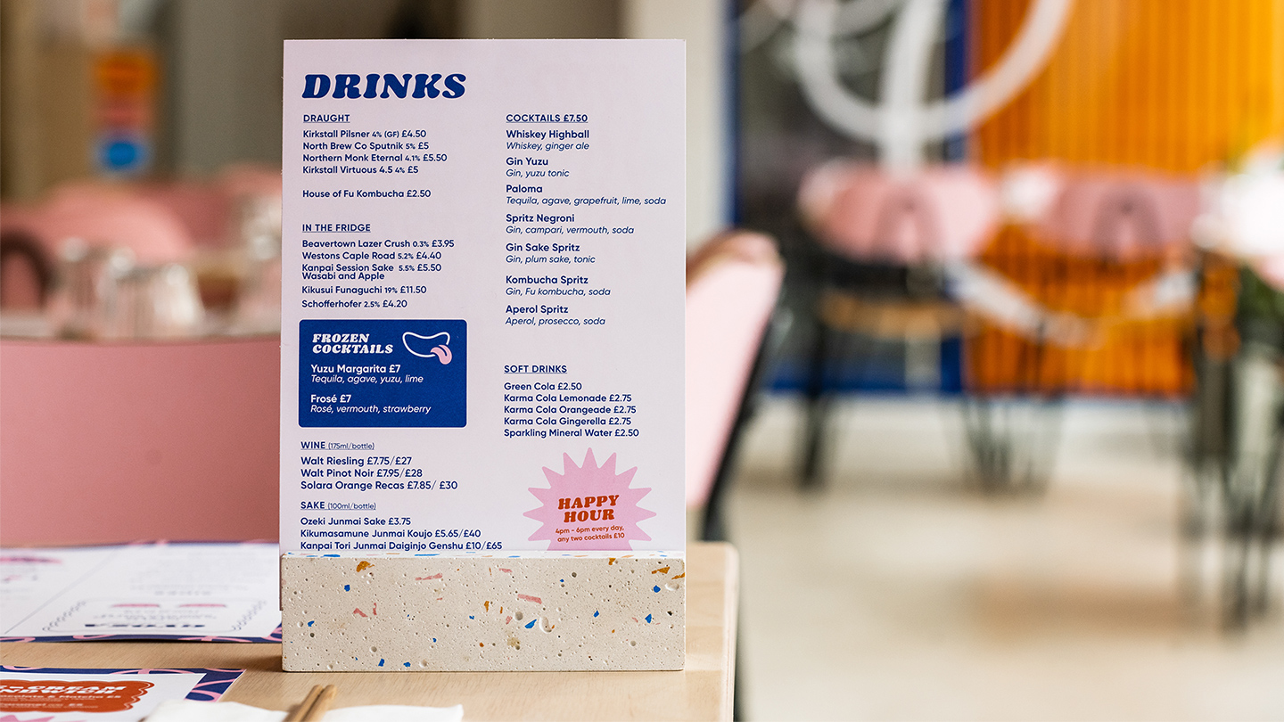
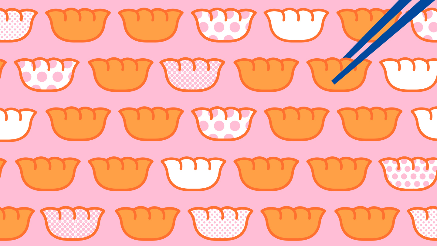
House of Fu’s visual identity flows seamlessly from the digital world to print, complimenting the interiors. Patterns stretch from menu designs to beer cars and the brand colours shine through the tableware to large neon signs.
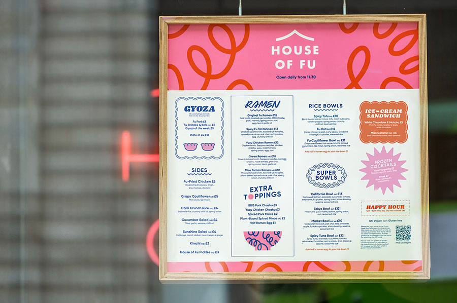
A playful menu design captures the energy of the dining experience using illustrations and graphics to break away from an otherwise traditional layout.
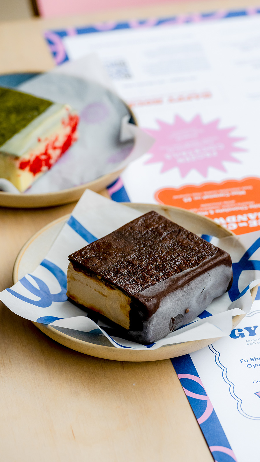
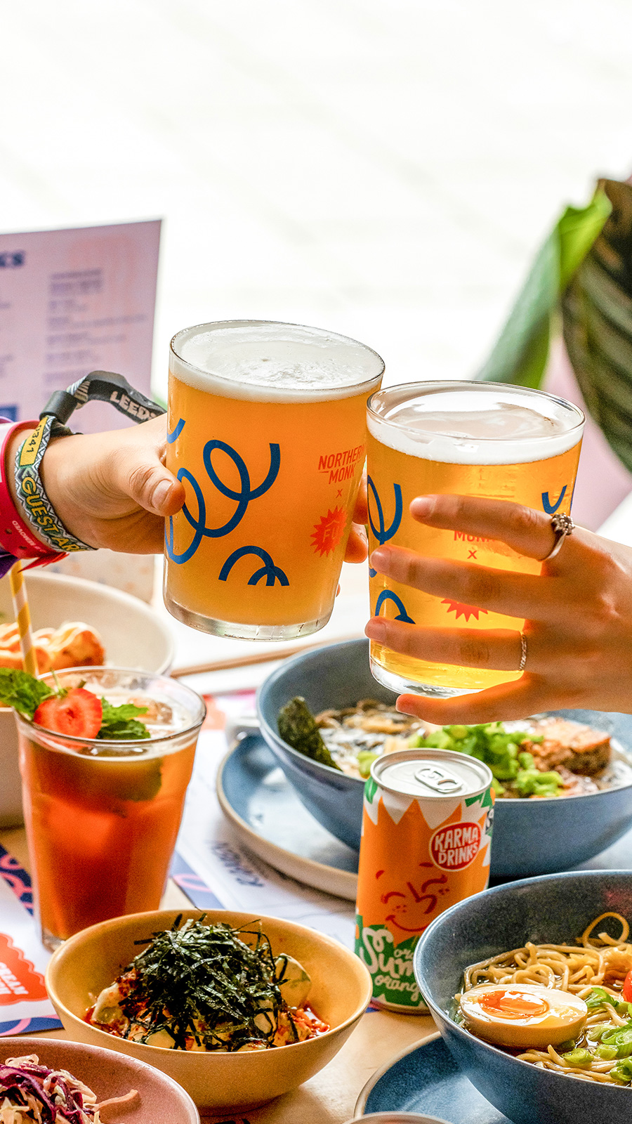
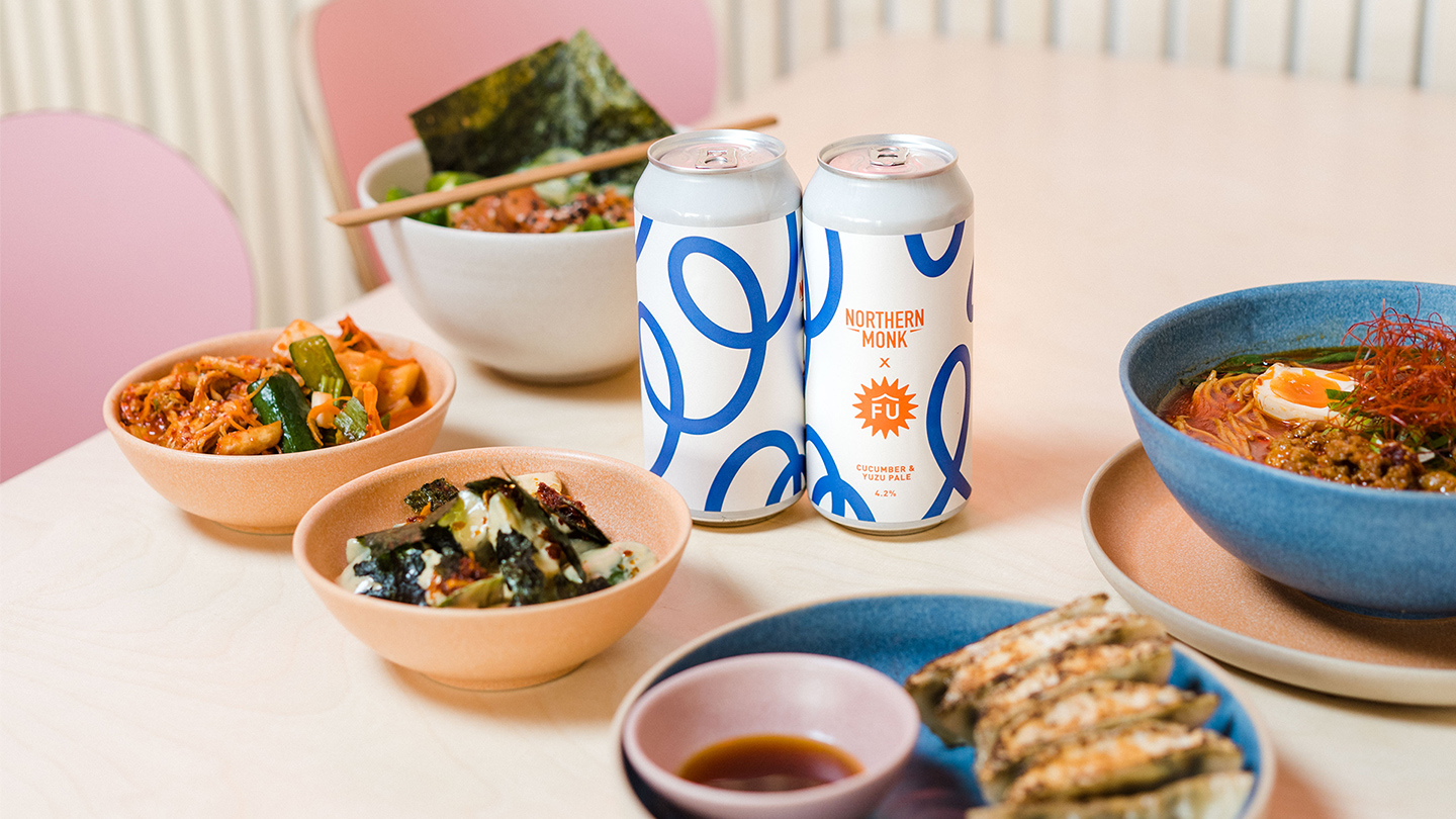
For authenticity, and a dash of the unexpcted, we replicated the signage that densely lines the streets of Tokyo. These lightboxes are a great carrier of bold visuals and way-finding.
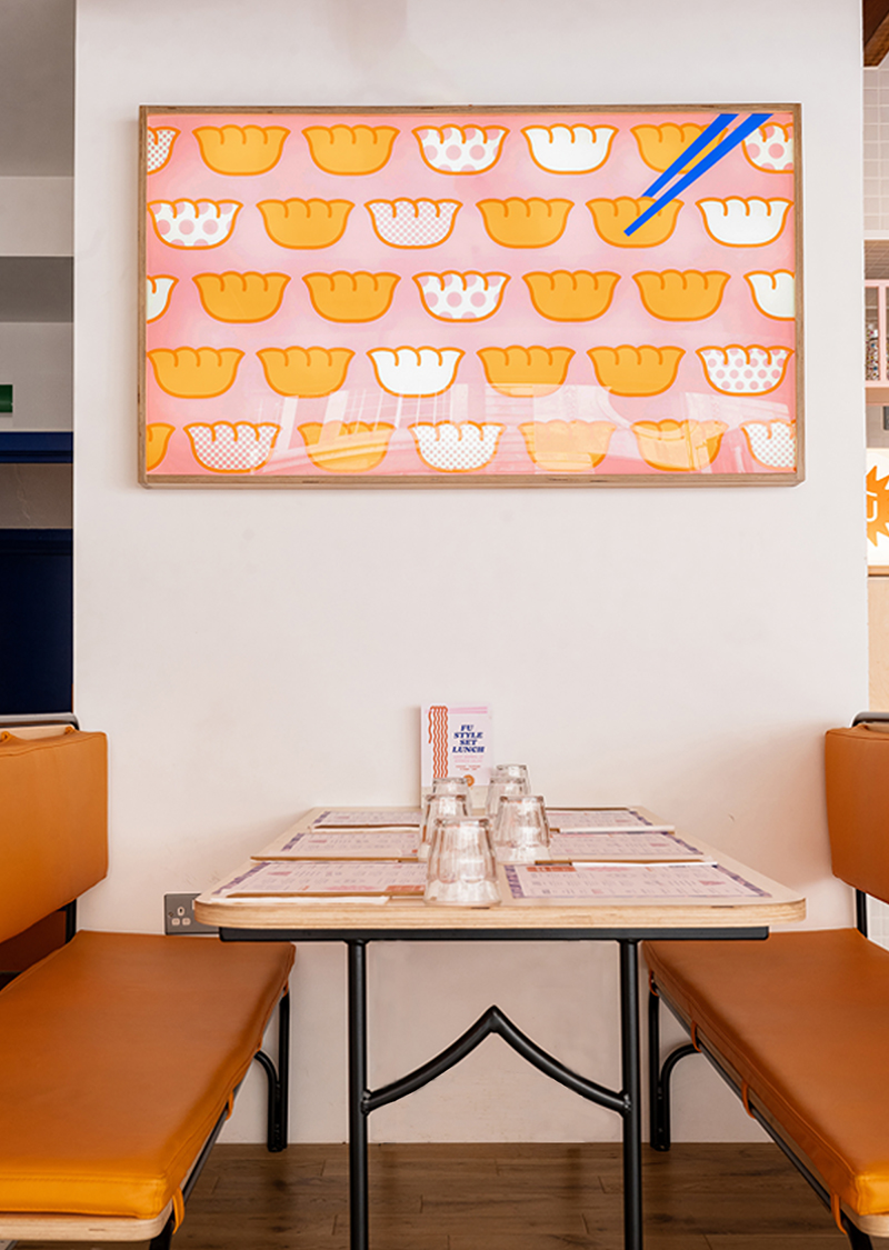
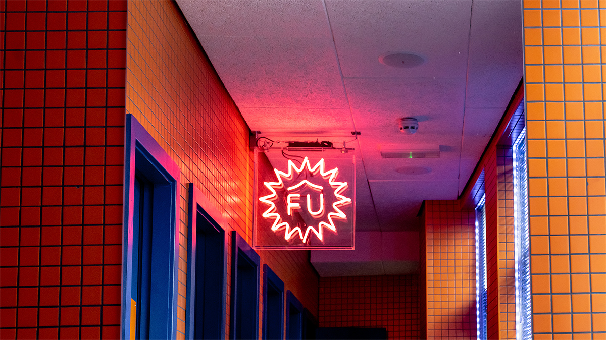
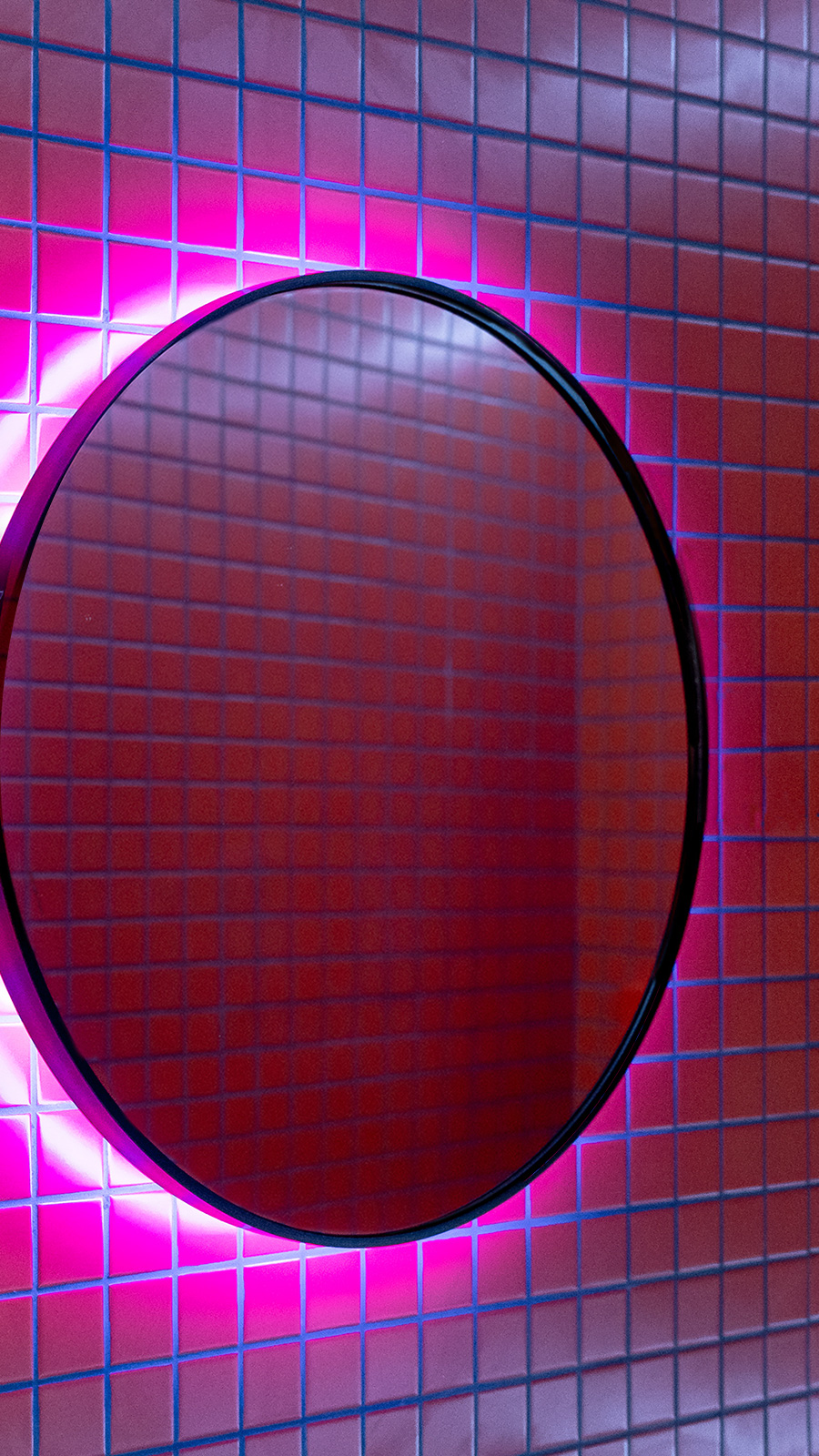
A reversed neon in the bathroom makes for the perfect selfie-light when looking in the mirror. The courtyard boasts a seven-metre animated neon sign that, when paired with 19th century brick walls and steel fire escapes, feels like a scene out of the anime Akira.
This theme continues into the 2nd and 3rd floors at House of Fu with its own identity ‘Hello’ see the full project here or by clicking the image below
“It’s a beautifully conceived space, deceptively simple, full of attention to detail. Zingy fresh branding, great service, top beers, and some excellent food. An indie that feels eminently roll-outable.” – Thom Hetherington, CEO Northern Restaurant & Bar